In March, Pinterest rolled out a new design for its profile pages. As expected, users flipped out.
It’s a little-known fact that social media users don’t adapt well to change when it comes to Facebook, Twitter, and now, Pinterest. When activity on these sites is so much a part of people’s everyday routines, it’s understandable that redesigns might not be immediately accepted. However, change is inevitable if social media wants to remain fresh in a constantly changing Internet market.
While many Pinterest users are interested in the new profile designs, the new layout has benefits – especially for businesses using the site to increase brand awareness.
Here’s what I love and hate about the new Pinterest design.
What to Love:
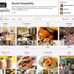
- The user profile, avatar, and info are now at the top of the page. Before the redesign, these elements were on the left-hand side of the page. At the top, the user info is more visible, which is especially beneficial to businesses using Pinterest to increase brand awareness. The profile at the top also allows for more space, making the page look less cluttered.
- Boards display the most recent pin as the largest thumbnail. Below the large thumbnail are the four most recent images. When they featured same-sized thumbnails, boards that were not filled yet tended to look empty on the profile page. With a large thumbnail filling up most of the display, the board can still look full, even with just one or two pins.
- Options and actions are on a single bar. Whereas the old design had the “Follow” button on the left-hand side and page view options at the top, it has them all on a single line beneath the main user info for more straightforward navigation.
What to Hate:
- The user profile and info section is way too big. Putting it at the top of the page is excellent for brand awareness, but the change also draws too much attention from the boards. Many users like to focus on the images of the actual boards rather than a user’s avatar. In addition, most profiles provide short, one- to two-line bios, making the extra white space look more like wasted space.
- The top right-hand “Repins from” section is confusing. This box shows a list of three other Pinterest users. However, it’s tough to determine whether these are users who have repinned the main user’s pins, or who have pins that the main user has repinned.
By now, most people are used to the changes and have probably already warmed up to them—until the next redesign, of course.
So, what do you think about Pinterest’s new profile pages?
Author Bio: Jacqui Mackenzie contributed this guest post. Jacqui is a writer for Straight North, an Internet marketing agency.
Related posts:
![Filtering the Feed: New Ways Consumers Shape Their Digital Experience]()
Filtering the Feed: New Ways Consumers Shape Their Digital Experience
![Defining the Spectrum of Brand Awareness and Media]()
Defining the Spectrum of Brand Awareness and Media
![The Hidden Risk of “Set It and Forget It” Marketing]()
The Hidden Risk of “Set It and Forget It” Marketing
![Turning Guest Reviews Into Marketing Content for Hotels and Restaurants]()
Turning Guest Reviews Into Marketing Content for Hotels and Restaurants
![Digital Marketing Trends for Small Businesses in 2026]()
Digital Marketing Trends for Small Businesses in 2026
![What Memorable Experiential Marketing Looks Like Today]()
What Memorable Experiential Marketing Looks Like Today


I like how you can now set the cover image for your boards, which is something I think they just introduced in the last few days. Seems like Pinterest is listening to user feedback, which is great. This means they’ll keep making tweaks, I hope!